In March 2026, choosing a color palette has shifted from following “rules” to a focus on Emotional Ergonomics. With homes serving as offices, gyms, and sanctuaries, the goal is to use color to signal to your brain how to feel in each specific zone.
Here is the 2026 framework for building a cohesive, modern palette.
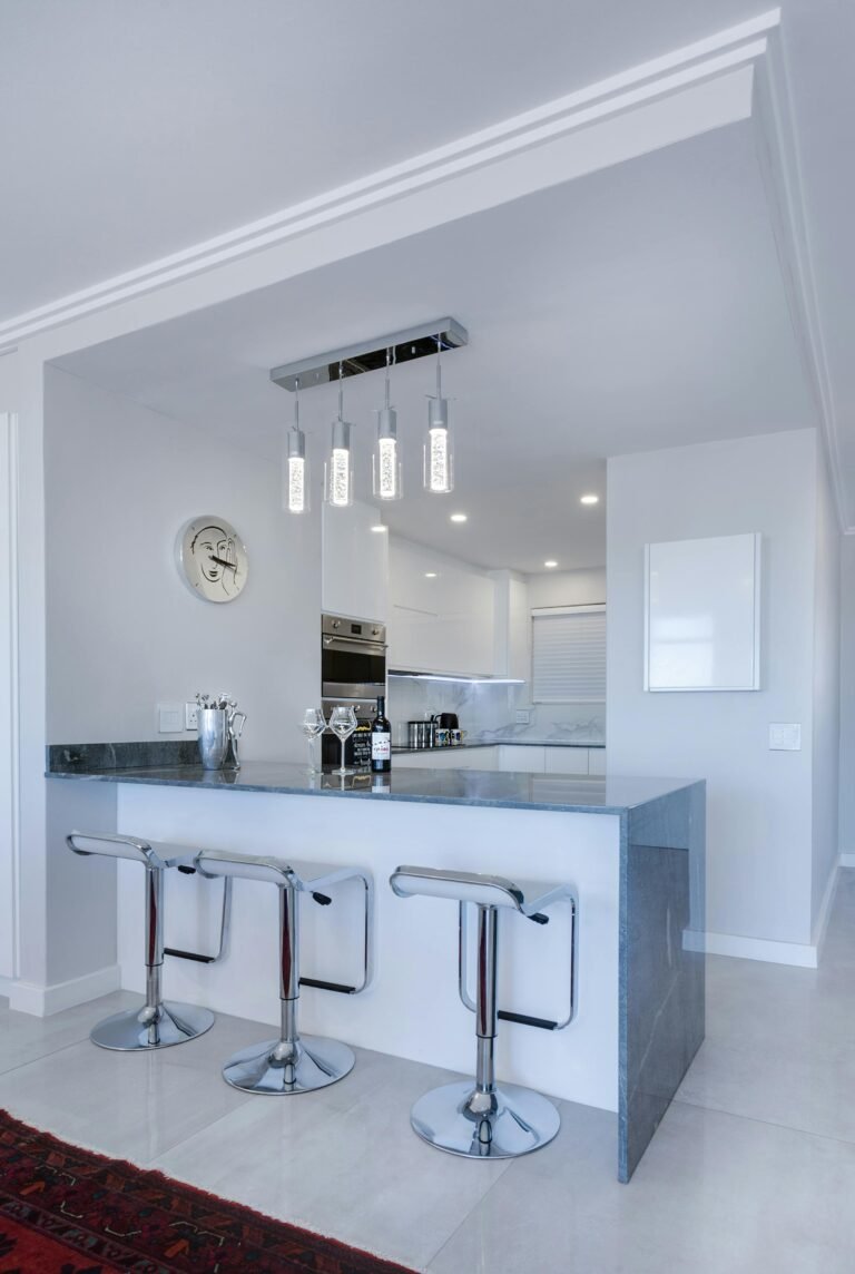
🎨 1. The “60-30-10” Rule (2026 Edition)
This classic interior design ratio remains the gold standard for balance, but the application has changed.
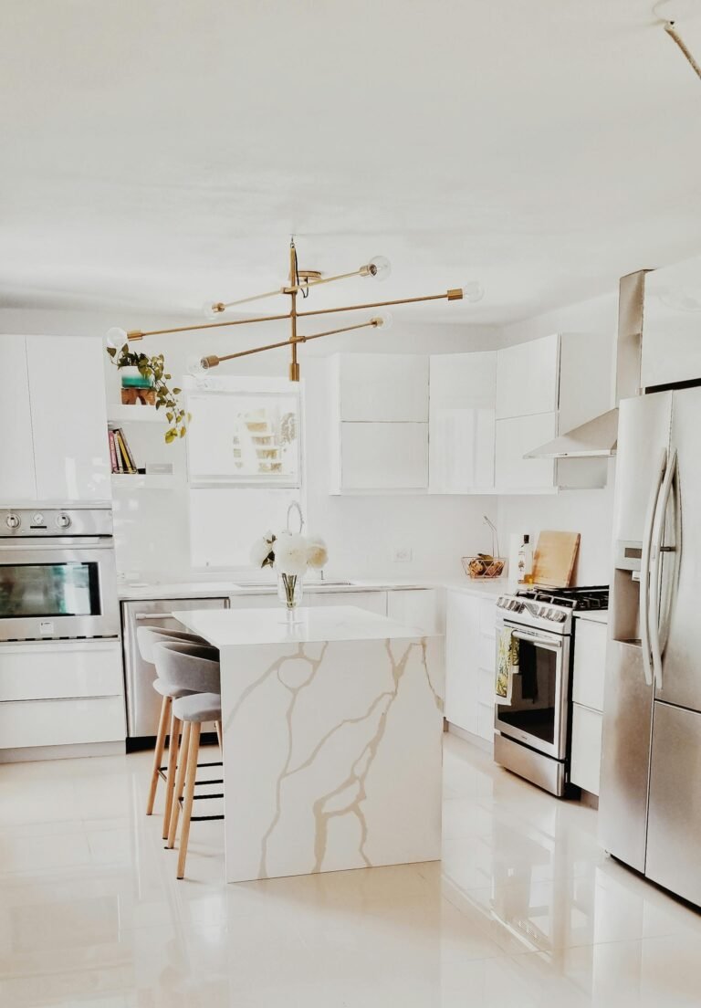
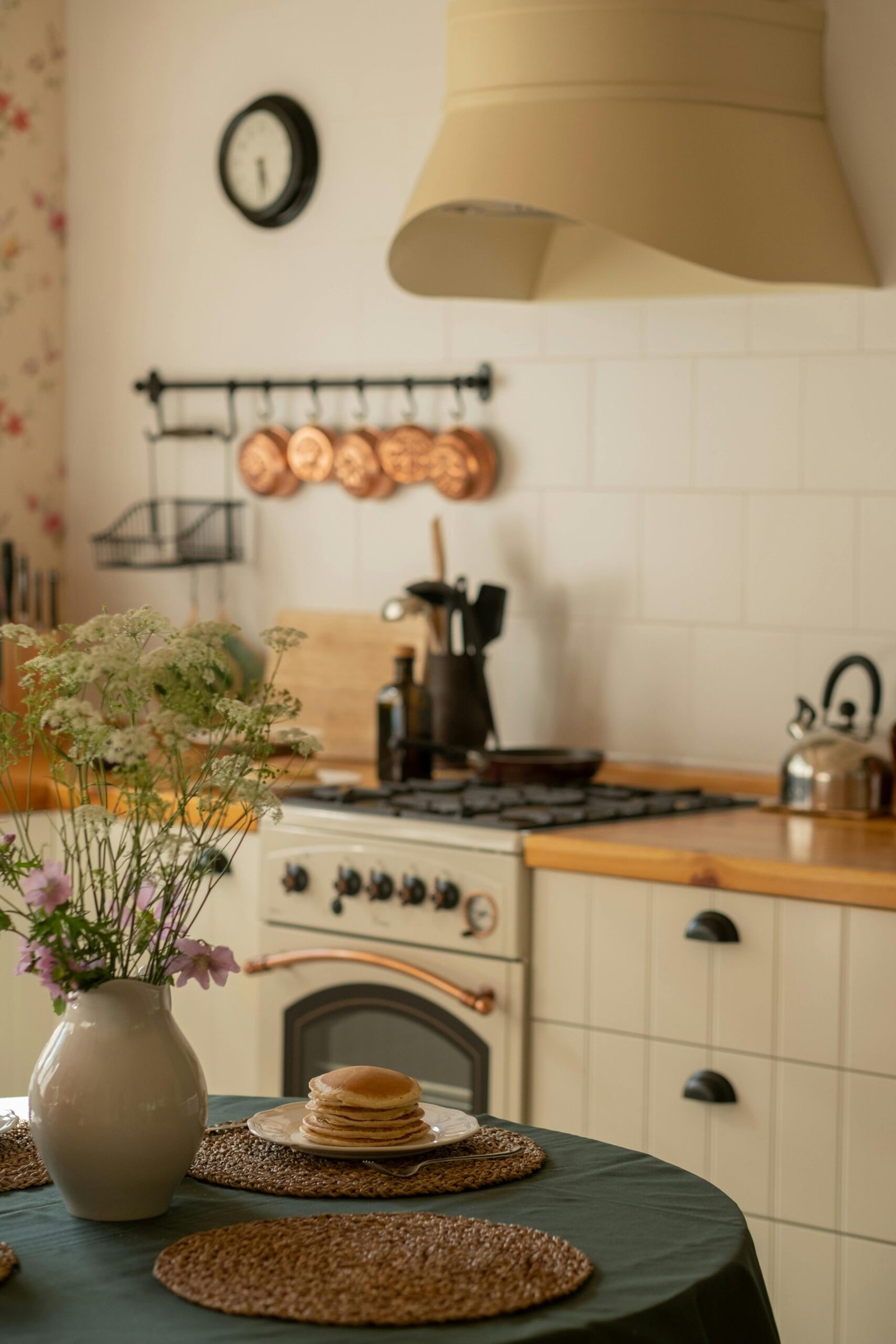
- 60% Primary (The Atmosphere): Usually your walls and large rugs. In 2026, we are seeing a move toward “Mid-Tones”—soft terracotta, sage, or “cremèle”—rather than stark white.
- 30% Secondary (The Support): Upholstery, curtains, and accent furniture. This should provide a soft contrast. If your walls are warm sand, your secondary might be a muddy olive or a deep slate.
- 10% Accent (The Spark): Small decor, art, or hardware. 2026 favorites include Unlacquered Brass, Deep Burgundy, or Chrome.
🌡️ 2. Identify the “Undertone”
Mistakes happen when you mix “clashing” temperatures.
- Warm Palettes: Reds, oranges, and yellows. These make a large, cold room feel cozy and intimate.
- Cool Palettes: Blues, greens, and purples. These make a small, cramped room feel airy and expansive.
- The 2026 Neutral: We are currently seeing a total rejection of “Cool Gray.” The new neutral is Warm Gray (Greige) or Mushroom, which feels organic and grounded.
💡 3. The “Light Test” Strategy
Colors are “chameleons” that change based on your windows.
- North-Facing (Cool Light): Use warm tones to avoid a “clinical” feel.
- South-Facing (Intense Light): You can handle dark, Moody colors or very cool tones that would look “dead” in other rooms.
- Pro Tip: In 2026, designers suggest painting a 2-foot square on at least two different walls and observing it at 8:00 AM, 12:00 PM, and 8:00 PM.
🎭 4. “Color Drenching” vs. “Zoning”
How do you want to move through the house?
- Color Drenching: Painting the walls, trim, and even the ceiling the same color. This creates a high-end, seamless “cocoon” effect.
- The Red Thread: To make the whole house feel “connected,” pick one color (e.g., a specific blue) and use it in a small way in every room—a pillow in the living room, a vase in the kitchen, a stripe in the bathroom rug.
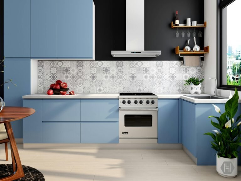
📊 2026 Trending Palette Combinations
| Palette Name | Primary (60%) | Secondary (30%) | Accent (10%) | Best For |
| Earthbound | Sandstone Beige | Moss Green | Rusted Iron | Bedrooms / Dens |
| New Heritage | Creamy White | Navy Blue | Aged Brass | Kitchens / Entries |
| Sunset Glow | Dusty Peach | Terracotta | Espresso Wood | Living Areas |
| Digital Zen | Soft Lavender | Sage | Brushed Chrome | Home Offices |
🛠️ 5. Practical Steps to Start
- Find your “Anchor”: Start with something you already own and love—a rug, a piece of art, or even a favorite jacket.
- Use a Digital Visualizer: In 2026, most major paint brands offer AI-powered apps that let you “live-preview” colors on your walls through your phone’s camera.
- The “Closet” Trick: Look at your wardrobe. The colors you feel most comfortable wearing are almost always the colors you will enjoy living in.
2026 Insight: Don’t be afraid of the ceiling. The “Fifth Wall” is being used more than ever this year to add depth and warmth to rooms that feel too “boxy.”
- Create a 2026 palette based on a photo
- List the best 2026 AI paint visualizer apps
- Draft a guide for ‘Color Drenching’ a small room